Brand element guidelines
If you've received permission to use our logo, product icons, or other trademarks, follow these guidelines.
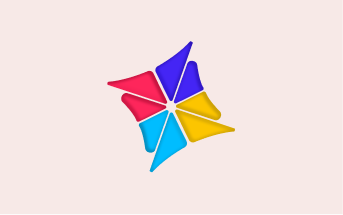
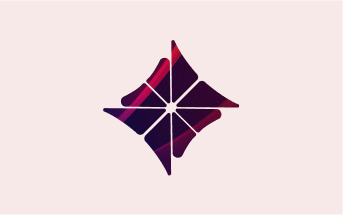
Hospyta Logo
Our logo comprises the cardinal icon and the Hospyta wordmark. A masterful embodiment of our brand identity, it fuses artistry with purpose in its elegant design. We can emblazon it just about anywhere leaving an indelible mark of sophistication, uniqueness and innovation that is synonymous with our company's ethos.

color version
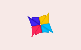
Colour and logo versions
Primary colour versions
Colour is the first visual thing we remember, and a powerful asset in building brand recognition. Our colour is Radical Red. We use it first, last, and for nearly everything in between.


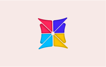
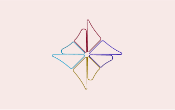
Logos in secondary colours
When deep into a marketing application, you can also apply our secondary palette to our logo. If it feels appropriate.
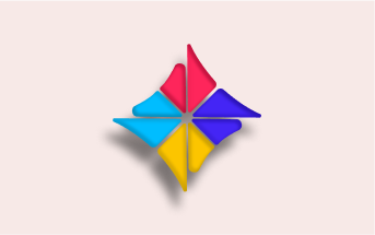
Using the Hospyta Logo Text
Wherever people see our cardinal icon, they can recognize a mark that signifies expertise and commitment to service. Let us use it in a way that substantiates those values.
App tile
Our Cardinal Icon may be diagonally asymmetrical, should be. Here, it sits larger and more to the left than in any other context.
Social avatar
In social media usage, there’s not much to worry about.... So long as none of the pointy bits of our cardinal icon are lost beyond the edge.
Size and borders
Talking about being too closed to the edge...a bit of clear space in all directions will do just fine. And please always use with the word mark unless absolutely unsuitable.
Minimum logo sizes
Print — 6mm high
Digital — 35px high
Positions
Placing our cardinal icon in the corner makes it nice and visible without taking up too much room, especially digitally. It can fly centrally though — just give it plenty of space and make sure to place the word mark to the right or centered just below it, but never to the left of the cardinal icon.
Things to avoid
Hospyta Colour
When hospitals say no, Radical Red says go. It’s energetic and vibrant, just like the world we live in. And it’s our primary colour, supported by a lively secondary palette that’s as at home on buttons, as it is on billboards.
Core colours
As far as the public’s concerned, Wise is green. But to us, it’s Bright Green, Forest Green, and white with an 8% Forest Green tint thrown in.
Radical Red
HEX: #9FE870
RGB: 159 / 232 / 112
CMYK: 47 / 0 / 72 / 0
PMS: PANTONE 7487
Radical Blue
HEX: #9FE870
RGB: 159 / 232 / 112
CMYK: 47 / 0 / 72 / 0
PMS: PANTONE 7487
Secondary colours
Being the global business that we are, our secondary palette is inspired by the vibrant and energetic colours found around the world.
The more we get to know people, the more we show our secondary palette. Think of it as a visual metaphor for getting closer, and more comfortable.
Radical Red
HEX: #FCC500
RGB: 159 / 232 / 112
CMYK: 47 / 0 / 72 / 0
PMS: PANTONE 7487
Radical Blue
HEX: #FFBE8A
RGB: 159 / 232 / 112
CMYK: 47 / 0 / 72 / 0
PMS: PANTONE 7487
Radical Blue
HEX: #E2E2E2
RGB: 159 / 232 / 112
CMYK: 47 / 0 / 72 / 0
PMS: PANTONE 7487
Radical Blue
HEX: #9FE870
RGB: 159 / 232 / 112
CMYK: 47 / 0 / 72 / 0
PMS: PANTONE 7487
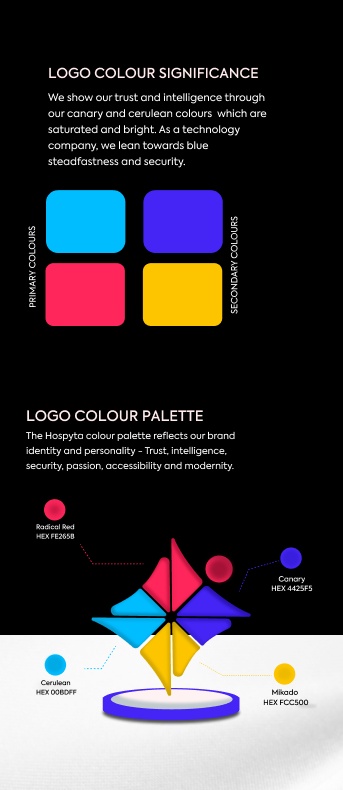
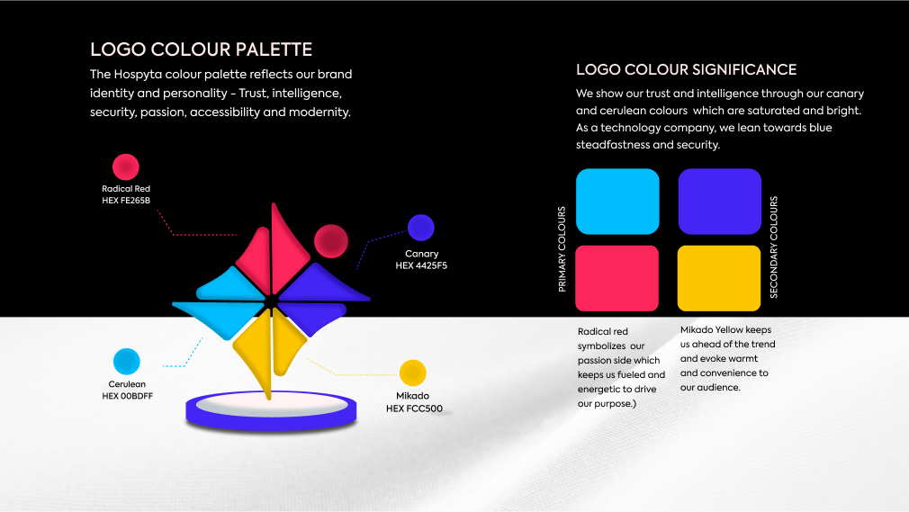
Logo colour palette
Always start and end with green. It’s our first impression and our bye for now.
But introduce the secondary palette when green is nicely established. So the further someone gets through say, an Instagram story, the more you can dial it up.
Icons
They say a picture paints a thousand words. Well, our icons do that too. They're the ultimate shorthand — straightforward, simple, accessible.
Approach
Less is more
Solid lines, simple shapes, no unnecessary parts. Easy as that.
Universally understood
We’re not trying to reinvent the wheel (icon). Clarity trumps clever concepts, especially for a global audience.
A perfect pairing
The icons are designed to complement our 2 typefaces — Wise Sans and Inter.
They feature the same rounded corners of Wise Sans, the cleaner form and light weights of Inter, and the square terminals of both.